[SAS]
DATA a1;INFILE '/home/joinos0/sas_class/tongcon_1110.csv' FIRSTOBS=2 DLM=",";
INPUT id $ gender $ mar age edu career s_work s_pay wage hob1 hob2 join $10. @@;
RUN;
PROC PLOT VPCT=70 HPCT=75;PLOT wage*age ; /* Y축 wage X축 age Y축 70%, X축 75% 축소
PROC PLOT VPCT=60 HPCT=75;PLOT wage*age ;
PROC PLOT VPCT=70 HPCT=75;PLOT wage*age/HAXIS=0 TO 50 BY 10 BOX ;
PROC PLOT VPCT=70 HPCT=75;
PLOT wage*age/HAXIS=10 TO 50 BY 10 BOX VREF=70 HREF=20 40;
PROC PLOT VPCT=70 HPCT=75;PLOT s_work*edu='+' career*age='*'/OVERLAY;
RUN;
PROC CHART; 등


[R]
# col -> color code
# pch -> plotting character
# cex -> character expansion
# lwd -> line width
# lty -> line type
# bg -> background color
# (1) 색깔, 문자표시, 점 추가, 텍스트 추가
plot.new()
x <- c( 1, 2,3, 4,5)
y <- c(10,22,35,42,51)
plot(x,y)
plot(x,y,col="red") # 점 색깔 표시
plot(x,y,col="red",pch=1:6) # 점 문자로 표시
points(3,40,pch=15) # 점 추가, 문자 표시 +
points(4,40,col="blue") # 점 추가, 색깔 표시
text(3,50,"텍스트")

# (2) 선그리기와 색깔넣기
plot(x,y,type='l') # 선그리기(연결하기)
plot(x,y,type='l',col="red") # 색깔넣기

# (3) 사각형그리기
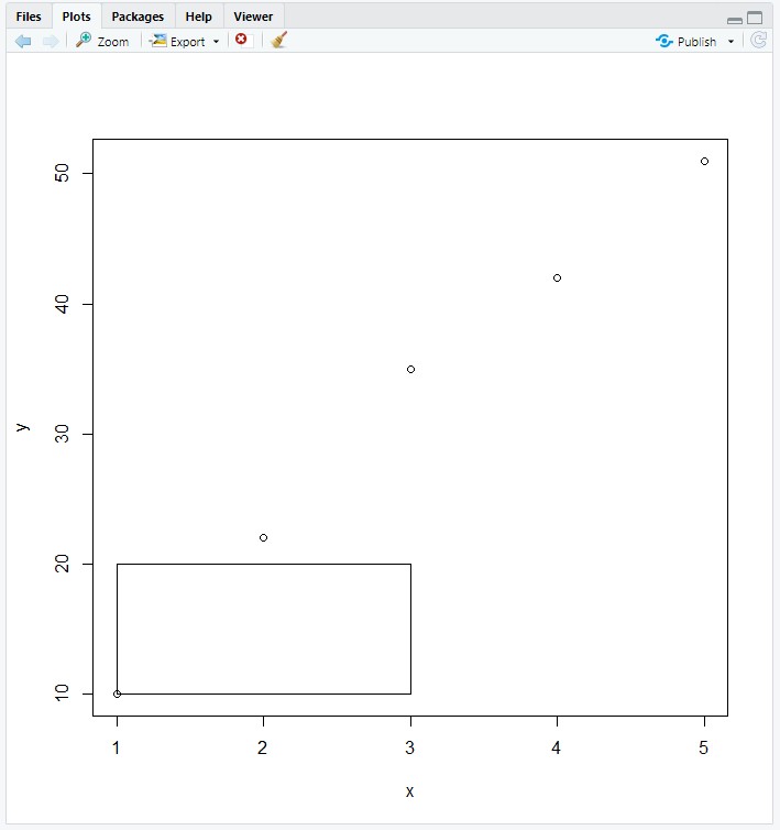
plot.new()
x <- c( 1, 2,3, 4,5)
y <- c(10,22,35,42,51)
plot(x,y)
rect(1,10,3,20) # 사각형그리기
# (4) 수평선그리기
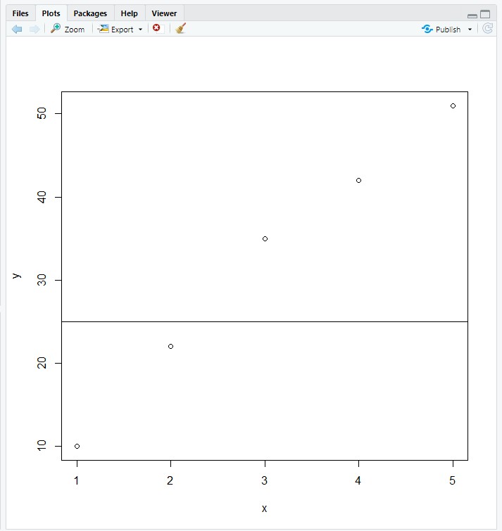
plot.new()
x <- c( 1, 2,3, 4,5)
y <- c(10,22,35,42,51)
plot(x,y)
abline(h=25) # 수평선 그리기
# (5) 텍스트와 타이틀 넣기
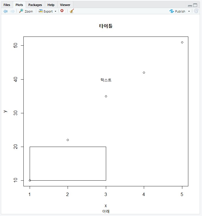
plot.new()
x <- c( 1, 2,3, 4,5)
y <- c(10,22,35,42,51)
plot(x,y)
rect(1,10,3,20)
text(3,40,"텍스트") # 3,40 위치에 "텍스트"
title("타이틀")
title("타이틀","아래")
title("","아래만")
# (6) lty(line Type)과 lwd(line width) ---
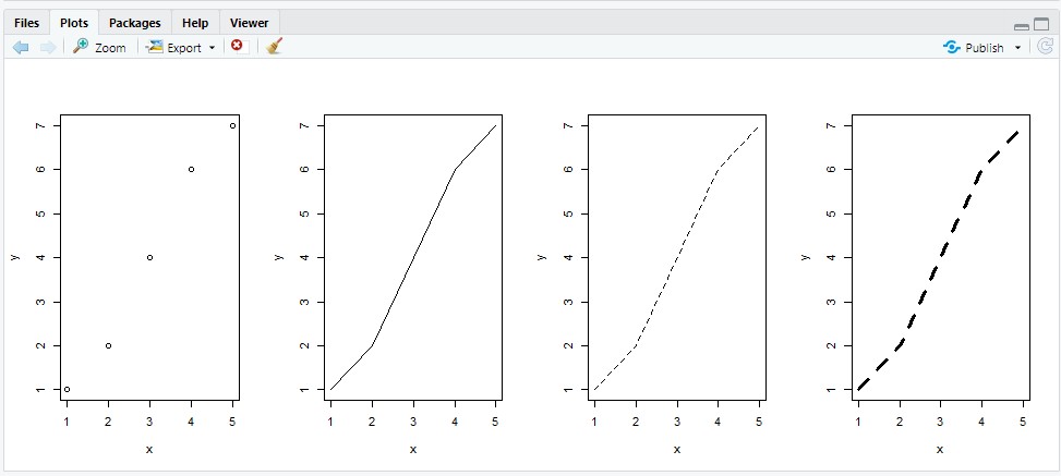
plot.new()
par(mfrow=c(1,4))
x <- c( 1,2,3,4,5)
y <- c( 1,2,4,6,7)
plot(x,y)
plot(x,y, type="l") # Solid line (by default)
plot(x,y, type="l", lty=2) # Use dashed line type
plot(x,y, type="l", lty=2,lwd=3) # Change line width
[Python]
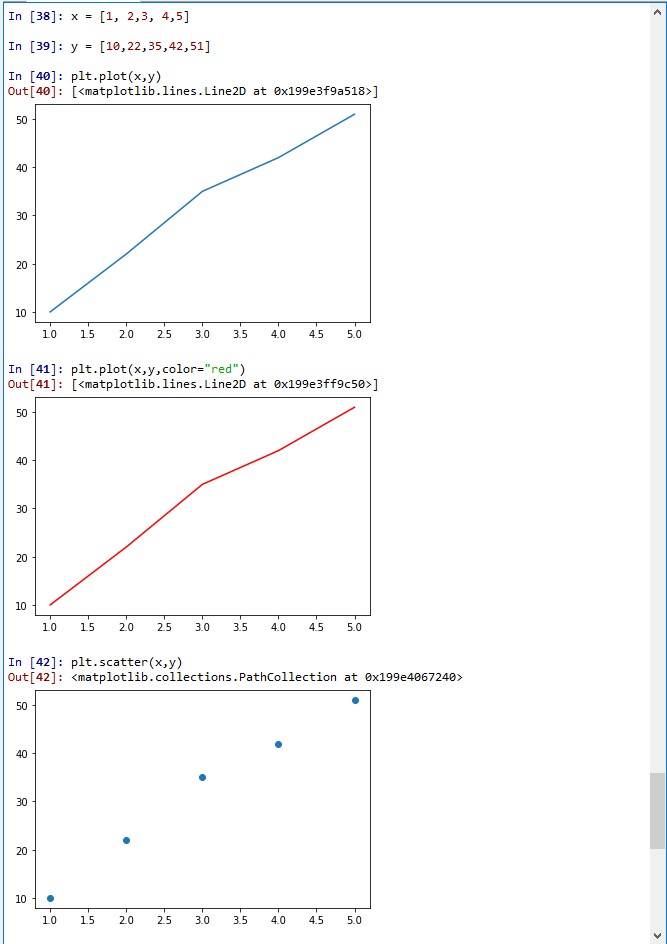
import matplotlib.pyplot as plt
x = [1, 2,3, 4,5]
y = [10,22,35,42,51]
plt.plot(x,y)
plt.plot(x,y,color="red")
plt.scatter(x,y) # scatter 그래프
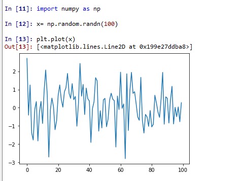
#넘파이를 이용한 난수 발생 그래프
import numpy as np
x= np.random.randn(100)
plt.plot(x)
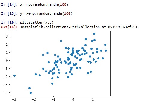
# Scatter 그래프
x= np.random.randn(100)
y= x+np.random.randn(100)
plt.scatter(x,y)
'R 일반 > 10. 그래픽다루기(1)(R)' 카테고리의 다른 글
| 10.0 그래픽 다루기 목차(R1) (0) | 2020.07.15 |
|---|